Tuesday, March 25, 2014
Composition Rules and Guidelines
5 elements of composition
The rule that I liked in the website was Pattern because it is abundant and simple and it can stress certain features in a photo. This will make every detail important and vital.
10 Top Photography Composition
Th rule that I liked was Depth because it shows the real potential of what a 2-D image can convey to the audience. It captures the correct angle expressing the sense of presence in the image even though the viewer may be in an entire different place.
Top 10 Composition Tips
The tip that I liked was " Pay attention to every detail" because a photo captures a specific image that has a restricted boundary due to the frame. This means that whatever is in the picture should be highlighted so the viewer can get the complete photo. This teaches people that each small detail counts.
Nikon 5 Easy Composition Guidelines
The tip that I liked in the website was Leading Lines because it works as a guiding hand through the picture to the viewer. It makes it easier to comprehend the picture and amazingly, it aids the person get the emotion from the picture.
14 Composition Techniques
The tip that I liked was Framing because it can work as a decorative and attention grabbing tool that will emphasize the targeted object.
Thursday, March 20, 2014
First Portrait Assignment.
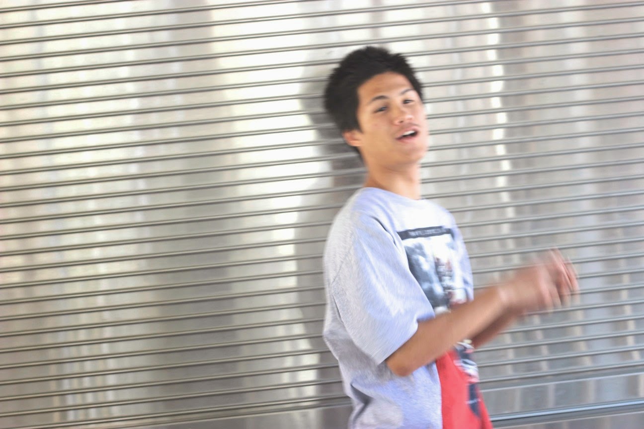
My subject was John Moore and I took pictures of him in front of a gate. Even though we took pictures in two different days and in two different areas I strongly felt satisfied by having a metal background, leading me to choose 5 pictures of that same day. I accomplished my goal of trying to make the subject forget about the camera and capture a unique picture by acting normal as if a camera didn't stand between us. I constantly maintained a descent conversation with him and pointed out things around us so he won't be focused and locked directly at the lens of the camera. This would describe all the different actions John is pictured in and in some of them jokes made him smile realistically and vividly.
These were the other Subjects that I photographed.
Tuesday, March 11, 2014
"My First Photo Outing - Principles of Design"
The Principle of Design that our group had was Pattern. Our adventure throughout the school quad led me to my destination of a trash bin that contained a dotted pattern throughout the casing. It shows a repetition of dots vertically and horizontally depending on what point of view it is seen in. This dotted pattern is important in the sense of "first impression" because it transforms the dull ,unattractive trash bin into something with more work put into it, rather than having a regular trash bin with no design. Ultimately, the pattern is evident due to the numerous amount of dots in a series that are pierced in the metal casing of the trash bin.
http://www.getty.edu/education/teachers/building_lessons/principles_design.pdf
Tuesday, March 4, 2014
Elements of Art Images.
Shape
Space
Texture
Lines
Space
Texture
Lines
Color
http://www.getty.edu/education/teachers/building_lessons/elements_art.pdf
Subscribe to:
Comments (Atom)


